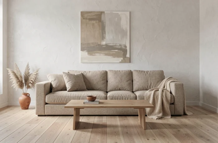
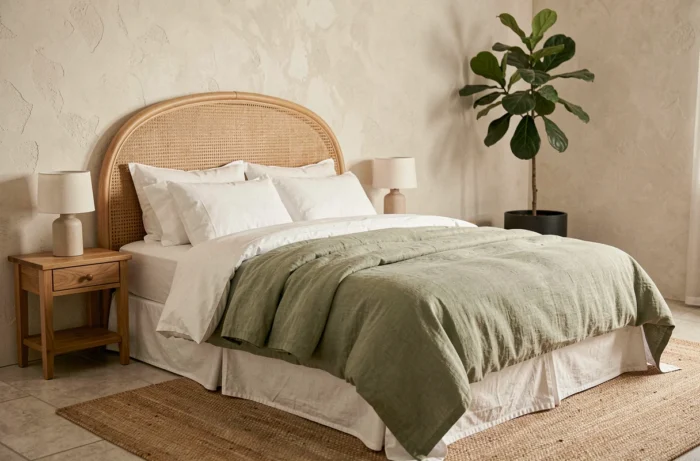
The cold minimalism, lacquered surfaces and pure white walls, has given way to a more tactile approach to interior design. The 2026 decoration trends document a structural shift towards a warm minimalism where texture takes precedence over emptiness. Understanding this movement allows for consistent, sustainable, and truly elegant home decoration choices.
Textured materials and matte finishes: the technical foundation of a modern interior
We are witnessing an inversion of hierarchy among finishes. The smooth surface, long associated with modernity, is receding in favor of brushed, sanded, or patinated finishes. This change is not cosmetic: it alters the way light interacts with the walls of a room.
A lime plaster applied in two coats creates micro-reliefs that diffuse natural light instead of reflecting it directly. The result is a visually deeper space, less tiring for the eye, and perceived as larger than a wall painted in glossy white. The same logic applies to floors: a brushed waxed concrete or open-pore oak absorbs sound better and reduces reverberation, a parameter often overlooked in interior design.
Professionals who support these decoration projects offer useful resources for selecting these finishes: https://arno-deco.be/ gathers references suitable for this type of textured approach.
Three materials are capturing the attention of specifiers for the autumn-winter 2026-2027 season:
- Wood with visible grain (walnut, ash), installed without polyurethane varnish to maintain its natural roughness and raw touch
- Thin reconstituted stone, which allows for dressing a wall in the living room without overloading the supporting structure
- Looped textiles with visible weave (thick linen, uncarded wool), used on seating and curtains to break the flatness of spaces
Earthy palette and deep colors: abandoning pure white in decoration
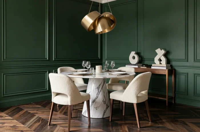
Pure white is no longer the default standard for a modern interior. This observation, documented by several 2026 decoration sources, marks a break from two decades of immaculate walls. Earthy palettes (terracotta, sand, clay, soft brown) are replacing optical whites on main walls.
We recommend working with tonal contrast rather than stark opposition. A dark ochre wall facing a light sand wall creates depth in the living room without resorting to a bright color accent. This technique, common in professional interior architecture, avoids the isolated “accent wall” effect that ages poorly.
Applying colors without error in each room
Saturation should decrease as the surface area increases. A saturated sage green works on the wall of a few square meters bathroom. The same green, applied to all four walls of a thirty-square-meter living room, overwhelms the space and becomes tiring on a daily basis.
Limiting saturated colors to passage areas or small spaces remains the most reliable rule. For the living room and main living areas, desaturated tones (rosy beige, warm gray, pale terracotta) provide a stable base that furniture and textiles will warm up.
Zone layout: rethinking space without partitioning
Open interiors pose a recurring problem: without partitions, each function (meals, work, rest) dilutes. The answer does not lie in reconstructing walls, but in the creation of micro-zones defined by furniture and lighting.
A sofa placed perpendicular to the wall, facing away from the kitchen, is enough to visually delineate the living room. A generously sized rug anchors the conversation area. On the open kitchen side, a return countertop (peninsula type) at a different height separates preparation from reception without blocking light.
Layered lighting to structure spaces
Lighting plays the role of an invisible partition. We recommend three levels in each main room:
- An indirect general lighting (diffusing ceiling light or LED strip in cornice) set to a warm temperature, around 2,700 K
- A targeted functional lighting (desk lamp, low hanging light above the table) for each activity zone
- A punctual ambient lighting (table lamp, candlestick, discreet garland) that activates or deactivates an area depending on the time of day
Each layer of lighting should be controlled independently. A single circuit with one switch negates all zoning efforts. Planning a dimmer for each circuit remains the most cost-effective technical reflex in interior renovation.
Curved furniture and organic shapes: a structural choice, not decorative
Curved lines dominate the 2026 furniture collections, but their interest goes beyond aesthetics. A sofa with rounded armrests visually occupies less space than a model with right angles of the same dimensions. The brain perceives angles as obstacles; curves, as passages.
In a narrow living room, replacing a rectangular coffee table with an oval or pebble-shaped model frees up circulation without reducing usable space. The same principle applies to storage furniture: a console with a curved front appears less massive than a straight buffet of the same depth.
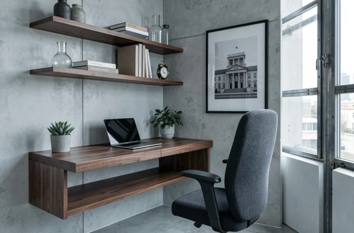
Furniture made of solid wood with organic shapes (tapered legs, softened edges) fits into the trend of warm minimalism. It brings the warmth of raw material and the softness of curves, two elements that enhance the welcoming character of an interior without adding visual clutter.
The choice of a coherent home decoration style relies less on the accumulation of objects than on the quality of surfaces, the accuracy of colors, and the logic of zoning layout. A modern interior in 2026 is recognized by what has been removed as much as by what has been added.